Anders Hesselbom
Programmerare, skeptiker, sekulärhumanist, antirasist.
Författare till bok om C64 och senbliven lantis.
Röstar pirat.
The ups and downs of Visual Studio 2010: Fonts and scaling
2009-12-13
The first time I head of the zoom feature of VS2010 was in a talk by Dag König at Microsoft. The level of readability is a very important question for me, and the font rendering of Windows (Clear Type) is superb compared to the blurry font rendering that Macintosh has. The big question, does the zoom feature affect the font rendering of the text editor? To the left, Visual Studio 9 with Consolas 8. To the right, Visual Studio 2010 with Consolas 8.

VS2010 still uses clear type, and the readability is still there. The hue is slightly reduced, if the anti aliasing is too gray, the text will appear blurry as it does on a Macintosh that only uses a gray scale for smoothing edges. The upper side of reducing the hue is that smoothing works better with text in different colors. In VS2010, the default color for a class keyword in Visual Basic is cyan as opposed to black in VS9.
And the zooming feature: Hold down Ctrl and use your mouse wheel. Not a feature I use every day – I use a font size that I can read without zooming, but really cool to use in presentations.
The .NET Framework lets you control how text is rendered in your programs. The property of the Graphics object you use to control this is called TextRenderingHint. Examine this code:
Private Sub Form1_Paint(ByVal sender As Object, ByVal e As System.Windows.Forms.PaintEventArgs) _
    Handles Me.Paint
    Using B As New System.Drawing.Bitmap(300, 300)
        Using G As System.Drawing.Graphics = System.Drawing.Graphics.FromImage(B)
            Using F As New System.Drawing.Font("Consolas", 10)
                G.FillRectangle(Brushes.White, 0, 0, 300, 300)

                'Regular smoothing
                G.TextRenderingHint = Drawing.Text.TextRenderingHint.AntiAlias
                G.DrawString("Hello", F, Brushes.Black, 10, 10)

                'Regular smoothing with grid fit
                G.TextRenderingHint = Drawing.Text.TextRenderingHint.AntiAliasGridFit
                G.DrawString("Hello", F, Brushes.Black, 10, 25)

                'Clear Type smoothing with grid fit
                G.TextRenderingHint = Drawing.Text.TextRenderingHint.ClearTypeGridFit
                G.DrawString("Hello", F, Brushes.Black, 10, 40)

            End Using
        End Using
        e.Graphics.DrawImage(B, 0, 0)
    End Using
End Sub
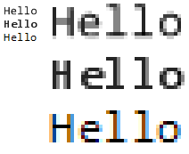
The option called AntiAlias renders text in a similar way to the Macintosh. The text appears blurry, but the outcome has true proportions, meaning that what you see on screen is a blurrier version of what you would see on a printed version. This option works best in high resolutions and for print previewing.
The AntiAliasGridFit makes the text less blurry, because letters align to the pixel grid of the screen. The downside is that character spacing is incorrect, but readability is much higher. This option works best with CRT screens.
The ClearTypeGridFit also aligns characters to the pixel grid, but it uses clear type. This option works best with a flat screen.
The output from the above code is shown here:

Categories: Visual Studio 10
3 responses to “The ups and downs of Visual Studio 2010: Fonts and scaling”
Leave a Reply
En kopp kaffe!
Bjud mig på en kopp kaffe (20:-) som tack för bra innehåll!


[…] Read more here: WinSoft.se » The ups and downs of Visual Studio 2010: Fonts and … […]
Thank you.I am just a beginner and 71 years old.
From Visual Basic 5 I moved on to Visual Studio 2010 Professional Beta 2.Today I started graphics because I have to draw some lines.Got stuck.
This page of yours may help me to move forward.
Thank you
[…] The level of readability is a very important question for me, and the font rendering of Windows (Clear Type) is superb compared to the blurry font rendering that Macintosh has. The big question, does the zoom feature affect the font … View original post here: WinSoft.se » The ups and downs of Visual Studio 2010: Fonts and … […]